
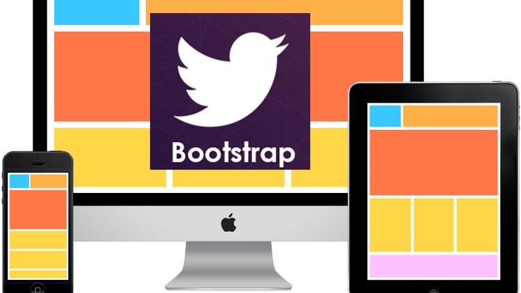
Bootstrap with Responsive Web Design
Bootstrap is touted as one of the most popular CSS, HTML and JS frameworks which are used to come up with mobile first projects and responsive websites for the World Wide Web. Why is there so much hullabaloo about Bootstrap? The main reason is that this framework facilitates easier and faster web development on the front end. This is designed for people who possess varying levels of expertise, for devices that come in all kinds of shapes and for projects of varying magnitudes. So, you can see that it is an all-encompassing framework, making things absolutely easy for the users.
What is a responsive web design?
It is a process wherein the websites are designed and built to offer greater accessibility as well as optimum viewing experience for the users. It is the ever increasing trend of users depending on tablets and smart phones that there is a huge surge in demand for the websites being optimized for all kinds of devices. When one has a responsive web design, getting across into multiple devices without losing out on quality becomes very easy.
Multiple features of Bootstrap
Bootstrap with its multiple features helps create the mobile friendly and responsive websites in an effortless manner. It gives better layout control and also shows how it is rendered on various devices too. The four tier grid classes facilitate this feature. This framework comes in with a set of tools that are free for creating responsive web layouts and common interface components. Advanced interface components can also be created with the help of the Bootstrap data API without even having to write a line of JS.
Copyright © 2024 creativewerkdesigns.com. All Rights Reserved.